![]()
5-15
Appendix N:
European Alphabetic Characters and Fonts
Diacritical Characters
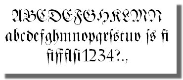
Some American readers may be unfamiliar with a few of the letter characters encountered in various places in this book, for example; characters such as an "a" with two small dots over the top. Those two dots are called "umlauts", and this letter is a "diacritical" character.
European readers will already be familiar with diacritical characters because they have been used extensively in European writing and documentation for centuries. Americans will often replace a character with a diacritical mark, such as the "ä" with a standard "a" because they do not realize that the modifying marks cause the letter to make a different sound.
This appendix will give detailed examples of proper usage of diacritical characters, but only those which have been used with frequency in in this work.
Umlauts
Characters with umlauts (two dots) over the top of the character create a different character, and are often seen in German and sometimes Swedish writing and printed material. Generally speaking, the umlauts has the effect of adding an "e" to the character. For example, ä approximates ae, ö approximates oe, and ü approximates ue. Some individuals listed in this work spelled their surnames Böhnstedt, and Bohnstädt. If one is to replace the umlauts-endowed characters, they would properly be spelled Boehnstedt, and Bohnstaedt.
Acute Accents
Characters with accents that look like apostrophes over the top also create a different sound. For example, the names Rene and René are pronounced differently. The é character, that is, an e with an accent, is pronounced "ay". Thus René is pronounced Ren-ay, whereas Rene is properly pronounced Ren-eh.
Stod (Ø)
Danish and Norwegian languages make use of a character that looks like an o with a "stod", or slash, through through it, creating this character: Ø. However, this does not create a traditional o sound, as in "bone", but instead something closer to a u sound, as in "bull".
ß (Eszett)
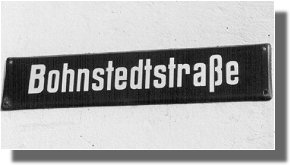
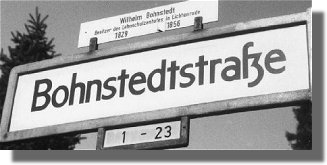
Another Character which shows up with frequency in this work is this odd looking letter above, called an Eszett. This is not a standard alphabetic character used in the English language, but does appear in the German alphabet, along with ä, ö, and ü. In the two images below both streets use the ß, or "Eszett" glyph.
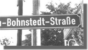
1. Hermann-Bohnstedt-Straße in Zossen, Germany
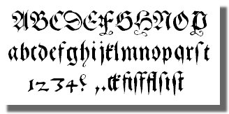
2. Bohnstedtstraße in Gotha, GermanyThe simplest explanation for the Eszett is derived from old German scripts and is a compound of a long S sound and Z as shown below:
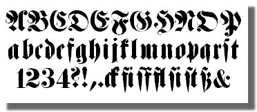
Another form of Eszett is a compound of a long S sound and a regular S as shown below:
The street signs from Hermann-Bohnstedt-Straße" in Zossen and Bohnstedtstraße in Gotha appear to use the "ss" form of the Eszett, while Bohnstedtstraße in Berlin-Lichtenrade (below) appears to use the "sz" form.
3. Bohnstedtstraße in Berlin-LichtenradeMy understanding of the Eszett has been disputed on one occasion by a native German, but this is what my own research revealed. However, if I am mistaken in this I hope I will be forgiven by Bohnstedts in Germany.
A Brief History of the Fraktur Typeface
German Emperor Maximilian who ruled from 1493 to 1517 commissioned a new typeface to be used for library of printed books he intended to establish. It was to be distinctly German in style, as opposed to the Antiqua typeface, which was based on the old Roman lettering, and is very similar to the Times New Roman used today in most newspapers and publications. The new typeface was designed by calligrapher Leonhard Wagner and soon became known as "Fraktur".
4. Gebetbuch Fraktur, the first true Fraktur font to be developed, it was designed by Leonhard Wagner for emperor Maximilian.
The flood of literature that accompanied the reformation movement that swept across Germany in the 1500's and 1600's was printed with the new Fraktur typeface, making it widely popular. Fraktur became increasingly popular throughout Germany throughout the 1700's and 1800's as new and varied forms of the Fraktur typeface were designed.
Fraktur continued to be used for most works intended for general audience well into the 20th Century. After World War I Fraktur began to decline in popularity as German society became more open to international influences.
5. Fette Haenel Fraktur created in 1846 by Eduard Haenel is a good example of the "modern" Fraktur typefaces developed in the 1800's and used for news headlines and advertising purposes.
This trend reversed with the rise of the Third Reich and the Nazi glorification of all things German, and conversely, a suppression of anything considered "Un-German" or "Non-Aryan". Fraktur was viewed by the Nazi regime as the only true German typeface, all publications were printed in this font, while other other typefaces and fonts quickly went out of use.
Some of the documents that were used as source material for this work were written (or printed) in "Fraktur" font or typeface. One of these documents is the "1939 Stammbaum" which was drawn up by the artist, Edgar Bohnstedt, using a form of Fraktur.
Interestingly it was Adolf Hitler himself who abolished the use of Fraktur in 1941. It soon became clear that Fraktur had become a communications barrier and with other peoples of Nazi occupied Europe, and therefore a hindrance to the administration of the conquered countries. Hitler's order directed all newspapers and publishing houses to switch to the Antiqua font at the earliest possible date. However, because of economic difficulties brought about by the war, most newspapers and publishing houses never got around to switching to Antiqua, and Fraktur was still in widespread use by the end of the war in 1945.
6. Zentenar Fraktur was developed before the Second World War and is considered by some to be the best form form of Fraktur typeface ever developed.
In some respects Fraktur typeface has taken a beating in Hollywood movies throughout the years which associate this typeface with the Nazi regime. But as Germans know, it was around long before Hitler.
See Also:
5-11 / Appendix J: Stammbaum der Familie Bohnstedt (1939)Back to Appendices ...
Back...>>>>>>>>>>>>>>>>>>>>>>>>>>>>>>>>>>>>>>>>>Continue...